When Perfect Correlations Dissolve Into Dust


Time is a faulty correlation’s worst enemy. Time separates universal and plausibly causal relationships from those that merely happened to correlate. We call the latter “spurious” correlations: variables that statistically moved together but are not related, either directly or indirectly.
By way of example, Tracy Alloway at Bloomberg has long monitored the price movements of Mexican Hass avocados and the dollar price of bitcoin, noticing that they track one another remarkably well. Nobody believes that bitcoin is involved in the pricing of avocados or that Mexican avocado traders are running the world bitcoin market. Statistically, the two lines follow each other closely enough that somebody could invent a plausible story for how avocados rule the crypto world — watch out for that one!
There are countless such laughable correlations around — like the per capita consumption of margarine and the divorce rate in Maine or non-commercial space launches and U.S. sociology PhDs. Correlation is not causation, and to hone in on causal mechanisms in economics or social sciences generally, there is a lot more statistical nitpicking involved. Letting time run its course, however, is usually a simple way to debunk some alleged statistical relationship.
One example on Tyler Vigen’s amusing website Spurious Correlations is the number of lawyers in South Dakota and the number of pedestrians killed by car, pickup truck, or van — yes, the Centers for Disease Control and Prevention, the government agency that tracks “Underlying Cause of Death,” is oddly specific. Between 1999 and 2010, Vigen reports, this correlation was almost perfectly inverse (-0.94). For every additional lawyer in South Dakota, pedestrian deaths across the United States fell by over four people.
Because this instance is so absurd, nobody would read anything into this relation beyond suggesting that perhaps they are both caused by some common factor — say, economic growth protecting pedestrians as well as generating needs for lawyers in South Dakota. For a decade, these two numbers just happened to align and gave us a jolly good laugh.
Adding in the next seven years of records shows the spurious nature of the correlation: running the stats between 2008 and 2017 (last available CDC data) returns an insignificant correlation of -0.17, an R-square — a statistic measure of fit — of 3 percent. Relationship gone.
The problem with most closely correlated observations is that we intuitively interpret them as meaningful signals even when we shouldn’t. Expanding time periods or comparing the variables involved on a different dataset, time period, or institutional setting is a valuable way of calling BS on fishy statistics.
In finance, we do these “out of sample” tests all the time. If a model derived and developed on one dataset in a certain country or time period also holds up in different settings, we are more confident that we’ve uncovered something real. While relationships that fail an out-of-sample test may still be correct, the failure suggests that the relation might be random, only selectively relevant, and at least weaker than we initially thought.
Take the size effect as an example. In finance, the size effect reflects the tendency for stocks of smaller firms to outperform stocks of larger firms even after controlling for market betas (return sensitivity with respect to the average stock market). After it was first discovered by Rolf Banz in the 1980s and replicated by Fama and French in their foundational cross-sectional paper in 1992, the effect became common knowledge. Everybody knew that small firms overperformed, and it was believed to be a universal feature of financial markets; asset-management firms went to town, and money poured into small-cap funds. As I was looking at stock market returns in 19th- and early 20th-century Britain — a much less liquid and informationally sophisticated market than today’s — I too found a size effect for stock returns, in a setting well before asset-pricing theories had developed.
Then, in the late 1990s and the first decade of the 2000s, the size effect disappeared. Suddenly, no matter how hard financial economists tried, they couldn’t find it — until it emerged alive and well in a paper by David Aharon and Mahmoud Qadan late last year.
My point is not to weigh in on whether the size effect is real — much more competent financial economists are already investigating that — but to remind us that statistics applied to the best of our abilities may still lead us astray. Statistics may mistakenly attribute signals to what is nothing but noise.
The Year of the Yield Curve
2019 became the year when the “yield curve” entered the public’s vocabulary. Why? Well, the yield curve “inverted,” which means that the return on long-dated government debt fell below the return on short-dated government debt. Over the course of 2019, economists and commentators increasingly voiced their concerns since yield curve inversions, going back to the 1960s, have “reliably predicted all seven U.S. recessions.”
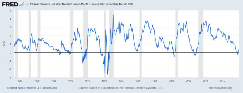
The underlying research about yield curve inversions comes from the Duke economist Campbell Harvey, a prolific, well-regarded financial economist who served as the president of the American Finance Association in 2016. During his doctoral work in the 1980s and in subsequent publications, Harvey found that an inverted yield curve — specifically the yield on 10-year bonds falling below the yield on 3-month Treasuries — indicated a recession 7–19 months down the line. Notably, the signal had no false positives (it only flashed when a recession was actually coming) and it has correctly predicted all three recessions since.
For the full seven-recession sample, the average time between yield curve inversion and the beginning of a recession is 14 months, which puts our next recession in the summer of 2020 — specifically August, if we’re counting from when Harvey sounded the alarm last year.
Since we’re all afraid of doom and gloom, news media more than anybody else, surefire predictions by reputable economists about an oncoming recession warrant lots of attention — particularly so in August, September, and October of 2019, when outlets from Fortune to CNBC and Financial Times widely publicized the infallible prediction.
The relevant St. Louis Fed graph is reproduced below, reaching back three recessions before the beginning of Harvey’s research. Expanding the time period covered reduces the seven-out-of-seven record that’s currently voiced. Using this specification (10y-3m), the yield curve just avoided turning negative before the 1990 recession; the yield curves of two recessions (1957–58 and 1960–61) prior to Harvey’s core period don’t invert; and there is even a false positive in 1966.
Now What?
Since the U.S. yield curve inverted last year, the Fed has cut its federal funds target on three occasions and yields on longer-dated bonds recovered somewhat. The yield curve, while still very flat, has resumed its regular upward-sloping shape. This led observers at the Economist, Matt Phillips of the New York Times, and Gillian Tett of the Financial Times to consider whether we could abandon the “inversion-watching chatter” and return to normal. Phillips correctly observed that the resumption of normality might still be too late: “Once the yield curve has predicted a recession,” he wrote, “one usually follows even if that signal changes later.” This is in line with Harvey’s original research. He maintains that the recession threat is still with us.
Of course, we will have to wait another 6 to 12 months to see if the model will grace us with another correctly predicted recession.
Even if it doesn’t, Harvey and his yield curve followers — like all creators of failed predictions past and present — can add some post hoc justification for why the metric misfired. A simple way of doing this is to extend the time coverage of their prediction as recessions have been a recurring phenomenon in the long history of capitalism; extend your prediction long enough and you’ll be right by chance alone. Considering that the current economic expansion is the longest on U.S. record, you might say that the economy is already overdue for a recession.
In general, prediction quacks and pushers of spurious statistics take great care in including open-ended time frames or being as vague as humanly possible — an age-old way of ensuring predictive success. Harvey’s yield curve story is merely the most sophisticated of these: If there is a recession in 2020, even if it is caused by something entirely different, Harvey can claim victory and add another observation to his yield curve story. If there is no recession, Harvey can claim that this time is different — say, large-scale asset purchases or liquidity and capital requirements have altered the underlying relation and blurred the signal.
To his credit, Harvey has specifically rejected that avenue, responding to his critics that this time isn’t different and that Fed bond-market intervention ought to have had a greater impact in the 1960s and 1970s than now, at a time when his predictive model seemed to have worked. This year, in other words, is shaping up to be a great yield curve showdown for inversion watchers.
Regardless of whether signals from the bond market accurately forecast recession, it’s unclear what an investor ought to do. Last summer, Fama and French ran the returns for various stock-and-bond portfolios following a yield curve inversion and came up way short; it almost certainly doesn’t pay to alter one’s investment strategy on a yield curve inversion.
The bigger statistical story here is the predictive power of carefully selected variables. Commenting on the yield curve scare in December, Michael Gayed of the Lead-Lag Report wrote that “there certainly hasn’t been enough data points to consider [yield curve inversions] statistically relevant, and many other things have to happen (or not happen) after inversion for a recession to hit.” While Harvey’s story has been remarkably prescient in the U.S. postwar period, we’re still talking about a signal with a sample size of seven. Few statisticians would trust that.
Statistical relations can be tenuous, and statistics can be fishy. Perhaps with time, Harvey’s yield curve relation will go the way of pedestrians and South Dakota lawyers — a near-perfect correlation dissolving into dust.
Joakim Book

Joakim Book is a writer, researcher and editor on all things money, finance and financial history. He holds a masters degree from the University of Oxford and has been a visiting scholar at the American Institute for Economic Research in 2018 and 2019.
His work has been featured in the Financial Times, FT Alphaville, Neue Zürcher Zeitung, Svenska Dagbladet, Zero Hedge, The Property Chronicle and many other outlets. He is a regular contributor and co-founder of the Swedish liberty site Cospaia.se, and a frequent writer at CapX, NotesOnLiberty, and HumanProgress.org.